Top 3 Healthcare Website Design Tips for 2022
Posted on
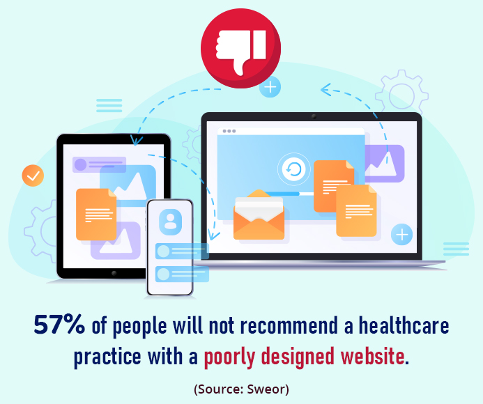
When it comes to best healthcare website design strategies and implementation, there appears to be a complete disconnect between what many healthcare organizations want and what most users/visitors expect to see when visiting their websites. While your final website design should capture your style, healthcare specialty and brand identity, there are a few best practices that, if followed, will help you build a website that appeals to a broad range of visitors.
With that in mind, our best healthcare website design tips for 2022 are all focused on giving visitors what they want and expect rather than what appeals to you as a healthcare provider. Your web design should enhance your user’s experience while being easy to understand visually. Following our healthcare website design tips will help make your site more compelling to visitors and potential new patients.
Here are the top three healthcare website design tips you need to stimulate more traffic and leads. Whether you are hiring a healthcare marketing agency or doing it yourself, these tips include healthcare marketing strategies that will help you build an effective website for driving traffic and converting leads.


1. Make Your Home/Welcome Page Patient-Focused and Clutter-Free
Your homepage or welcome page should connect with visitors emotionally and communicate your most important message instantly. Most patients will quickly scan the page and pick out appealing subheadings, keywords or images. If they don’t find what they want, they’ll quickly click away and look for another provider’s website.
Your most important, most compelling content should always appear high on the page and where it won’t be missed. You want visitors to understand what your healthcare practice website is all about without having to click or scroll.

Your home page should look clean and uncluttered. Resist the impulse to have content fill every inch of every page. Allow a generous amount of white space between paragraphs and around various elements – content, photos, video, branding info and call to action – on your page. Give your web page a more spacious, more inviting feel.
How do you make your welcome page content patient-focused?
Instead of beginning your welcome page talking about yourself, your credentials or your practice, talk about that patient who is visiting you for the first time. Connect emotionally by mentioning their frustrations, symptoms, solutions for their condition or how they’re feeling. Speak their language: casual, conversational and at a junior-high-school reading level. Most of all, let them know that you care about them.


2. Keep Navigational Structure and Intuitive Functionality in Mind
Your healthcare website should have a simple, intuitive site taxonomy or navigational structure. A website taxonomy is the way you organize your entire site so that it makes intuitive sense when users navigate from one page to another. In other words, organize your site so that any visitor can quickly understand how your site is structured. That way, users can find the information they’re looking for quickly and effectively and without seeking assistance from other people. That’s why the organization of your website is critical for attracting visitors.
What should a healthcare website design include?
- A logically arranged topline menu bar with dropdown submenus to help visitors quickly find topics that interest them
- A prominent call-to-action on every page that tells visitors what you want them to do
- Quality images and easy-to-understand charts or simple infographics that require no additional explanation
- A dedicated link for requesting appointments
- A search button or interactive search field prominently displayed on every page. This will help visitors avoid wasting time searching your entire site to find what they want.
- Readable content, type font selections and font sizes suitable for readers of all ages
- A limited color palette that includes soothing blues and greens that evoke health
- Visual balance where no single element draws too much focus or creates extreme asymmetry
- No massive blocks of text that will scare visitors away (instead, break text into short paragraphs with frequent subheads)
- Reviews and patient testimonials that are displayed prominently (these influence 70% of online purchasing decisions)
3. Make Your Content Emotionally Compelling and Easy to Read
It may be hard to swallow, but potential new patients don’t care which medical school you graduated from, which CME courses you’ve taken or what prestigious medical organizations you belong to. Talking about yourself in those terms will likely turn visitors off, especially if you start your home page or welcome page with something like “Here at XYZ Health, we treat patients like family.”
Sounds nice, but it’s been repeated on thousands of other websites, and it may not even be true in actual practice. The phrase “Here at XYZ Health” immediately distances you and your practice from your reader. It signals that your content is about you, not about them. What readers really want to know is what’s in it for them. How will they benefit by choosing you?

What’s the secret to writing content that engages a reader’s attention?
The secret is to pepper your content with more “you” and fewer “we” usage. People will read content that focuses on them. So always write from the reader’s point of view in their language, not yours. Keep in mind that their preferred language is casual, conversational and typically at about a 7th grade reading level.
Here’s an example of “we” versus “you”. This is a phrase you’ll find on many practice websites: “We offer extended weekend and evening hours.”
Pretty straightforward, right? Yes, but it’s also bland and uninspiring. Here’s how you might rewrite it: “You don’t have to miss work or school for your health visits anymore and your family’s care is now more convenient than ever.”
Which version do you think a reader will respond to most favorably? Remember, potential new patients care a lot more about themselves than they do about you.
If you write in MS Word, you can determine both the grade level and the “readability” score of your content. The readability score measures how easy it is for visitors to understand your words and sentences. Your healthcare website’s readability should be high, so visitors can engage with your content effortlessly.
Conclusion
These healthcare website design tips will enhance your website so it best represents your healthcare practice. However, if you are unsure about applying these essential design elements, don’t worry! Find yourself a reputable healthcare marketing agency that offers affordable web design, development and content writing services that will take your healthcare practice to the next level. Your site will attract more new patients and leads, maximize your conversions, and reduce bounce rates. Your professionally designed website will entice visitors to stick around and keep them coming back for more.

 What Are the First Steps When Planning a New Websi..
 SEO Strategies to Rank Your Dental Practice
 How AI is Driving Patient Engagement and Revolutio..